Blogspot Blog Ko Puri Tarah Se Mobile Friendly Kaise Banaye
In the current time, people prefer to use Internet more than mobile. Earlier, which used to give Futures to Desktop, now almost all of them also give futures to Mobile. That is why it is very important to have your Blog Mobile Friendly. So, today I am going to tell you through this post that “How to make Blogspot Blog completely Mobile Friendly”

Blogging can easily be done from mobile too. If you are a Blogspot user, then you may need a desktop.
There was also a time that people used to use mobile very rarely and desktop has become more but now its just Opposite. According to a research, it has been told that at present time 70% people use Internet Mobile only. And friends, why not do it because almost all the functions of Functions given on Desktop have been made available in Mobile as well.
Just a few days ago Google has announced that Mobile Friendly First Index i.e. Mobile Friendly Blog or Website will be shown first in Google Search Result. So, it clearly shows how important it is to have your Site Mobile Friendly.
Now I am telling you some steps. By following which you can make your blog completely mobile friendly.
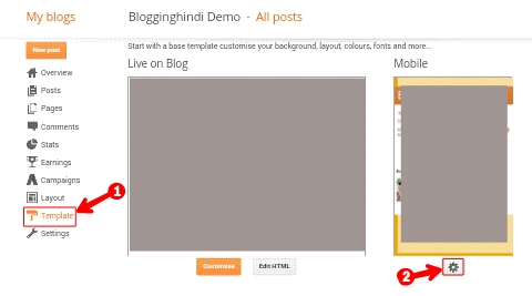
Step 1: First of all, you login to Blogger and then go to Blog's Dashboard.
- Now click on the template
- Now click on this icon

- Now ‘Yes. Select show mobile template on mobile devices
- Select Template here.
- Now save it.

Step 2: Now again go to the Blog Dashboard.
- Now click on the template
- Now click on Edit HTML

Step 3: Now Search for Now Paste the code below and save the template.
Step 4: Now copy the code given below.
/ * Laptops and Desktops * /

@media only screen and (max-width:

1280px) {

/ * The following css will be rendered if

device width is less than 1280px * /

}

/ * Tablets (Landscape) * /

@media only screen and (max-width:

1024px) {

/ * The following css will be rendered if

device width is less than 1024px * /

}

/ * Tablets (Portrait) * /

@media only screen and (max-width:

768px) {

/ * The following css will be rendered if

device width is less than 768px * /

}

/ * iPhones * /

@media only screen and (max-width:

640px) {

/ * The following css will be rendered if

device width is less than 640xpx * /

}

/ * Mobiles * /

@media only screen and (max-width:

480px) {

/ * The following css will be rendered if

device width is less than 480px * /

}

/ * Small Mobiles * /

@media only screen and (max-width:

320px) {

/ * The following css will be rendered if

device width is less than 320px * /

}
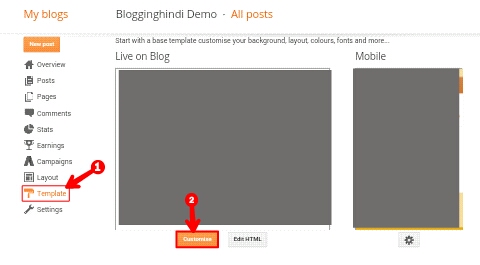
Step 5: Now again go to the Dashboard of Blog.
- Click on the template
- Click on Customize button

- Click on Advanced
- Now click on Add CSS.
- Past the code copied here.
- Now Apply to Blog Click on
Step 6:

.
.
.
.
.
I hope you liked this post. If you have any question related to this, then you can tell us in the comment. I will ask you to share the post in social media as much as possible.